Brand colours: mastering the perfect match

As a spray painting contractor, we spend our time immersed in the world of colour, and therefore understand its importance when it comes to branding. The colours that your brand uses are the visual identity that defines you as a company. They evoke emotions from your customers, bolster their connection to you and leave a lasting impression. The right colours can make your brand instantly recognisable, helping you to stand out in a crowded marketplace. In fact, according to Pantone, colour has the power to increase brand recognition by 87% and can even influence up to 85% of product purchases.
Consistency is key
It comes as no surprise then, that keeping brand colours consistent across all applications whether that be digital, in print, or featured on company buildings and stores, is a huge priority. But achieving this consistency across a range of surfaces and interfaces can pose some serious challenges. From your packaging to your digital presence and even your building, each surface requires different technologies and processes to achieve the perfect match – this can be hard to get right.
We are often provided with Pantone colour references when clients communicate their colour choices and these references are not compatible with paints suitable for use in architectural spray painting. Printing ink, which is what Pantone is, and on screen colours offer an abundance of colour options. Industrial paint goes by British Standard (BS) colours or RAL numbers, these are traditionally set up to create variations of grey, so a lot of work goes into matching the bright and bold brand colours we see today.
Leave it to the experts
This is where our expertise comes in. Our team comprises highly skilled spray painters and some may say that we are not just technicians – we are artists! We have the skill and knowledge in applying paint in a way that brings out the true essence of a brand’s colours, even on challenging surfaces.
What’s more, our strong and long-established relationships with our suppliers allow us to work closely with them to acquire colours which could otherwise be difficult to create. A great example of this is our recent work with Costa Coffee. It’s iconic burgundy is a colour created by the brand which is unique to Costa, meaning that there was no way this could be an ‘off the shelf’ job.
For this project, we used our extensive supplier base to colour match to perfectly match the burgundy. This meant that the colour of the external fabric of the building matched perfectly with that familiar colour that customers are used to seeing on their coffee cups.
Tried and tested experience
One of our core values is understanding the substrate and project-specific requirements to achieve long-term adhesion. This means that we work hard to help your colours stand the test of time. UV rays can cause fading, discolouration, and deterioration of paint. By using only high-quality paint which contains UV resistant additives we are able to protect against damaging effects of sunlight.
What’s more, colour perception can vary under different lighting conditions, threatening that all-important consistency. In order to mitigate these risks, we conduct rigorous testing to validate colour accuracy across a range of scenarios, ensuring all of our colours remain true in their application.
Your perfect match
We leave no stone unturned when it comes to achieving the perfect match. From surface preparation to the final coat, every step of our process is executed with meticulous attention to detail to ensure the colour matches your brand’s specifications. This is because we take pride in our ability to match and maintain your brand colours with precision. Whether you require a refresh of your corporate office, the application of brand colours on a new industrial structure, or any other architectural spray painting project, you can trust ORS to get it right.
Project spotlight: Pretty Little Thing
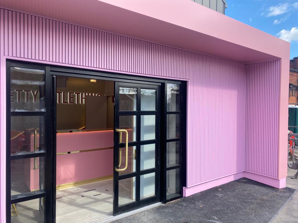
We worked with Pretty Little Thing’s Manchester HQ to create a visually striking front entrance. The team at PLT presented us a Pantone colour which we successfully matched to achieve a precise and desired aesthetic. The attention to detail and iconic pink colour resulted in an eye-catching finish that enhanced the overall appearance of the headquarters.


